
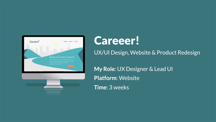
Careeer!
Website & Product Redesign
Brief
Careeer! is looking to redesign their website and their main product, the personalized roadmap.
problem
How can we get users to stay engaged with the personalized roadmap as well as get new users to subscribe?
solution
Create trust and value by adding more information on homepage and gamify the roadmap product.
Timeline: 3 weeks
Platform: Website
Tools: Pen, Paper, Sketch, Post-its, Adobe Illustrator, After Effects, Premier Pro, Adobe XD & Zeplin
Team: Chad Cates, Matt Phan & Louisa Garcia (me)
My Role: Lead UI Designer, User Research & Interviews, User Journey Map, Affinity Mapping, Design Studio, Wireframing, High Fidelity Prototype, User Testing and Prototype Video
design process
1. Research
BRAND RESEARCH
Our first attempt to address this website and product redesign
was to get to know Careeer! We read Medium articles, perused through
the website and spoke with stakeholder and CEO, Anya Iverova.

Founders of Careeer, Ryan Prust & Anya Iverova
Careeer!
Careeer's mission is: to make the burden of Career transitions obsolete.
By introducing a personalized roadmap, having ondemand coaching, and being an objective educational resource.
Their brand philosophy is: Give a man a fish and you feed him for a day. Teach a man to fish and you feed him for a lifetime.
SURVEY
After understanding the brand, we wanted to see how
users felt about job searching and career coaches.
Are you happy in your current job position?
Would you find a roadmap of your career track helpful?
Have you ever used a career coach before?
Have you considered a career change?
Interviews
We then conducted several interviews to get a sense of what new users thought career coaching is, how they search for jobs and current users how they found the product.
What we learned was:
users mixed career coaching with recruting
they couldn't find the value in the product
felt the tasks were confusing & long
“A career coach sounds like someone who would guide you
in your career or recruiter.”
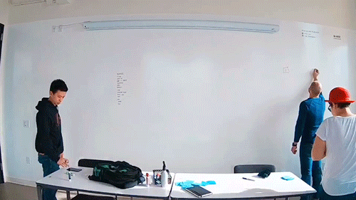
affinity map
We wrote down all the insights we found on post-its and looked for trends.
What we found is, the lack of information on the website
didn't convey value or trust in the brand or the product.

Time lapse of the team creating an affinity map
“If I’m looking for a job it means I
don’t have disposable income.”
Click to enlarge.
user persona
Meet Dan Sullivan.
A bartender with a graphic design background. He spends his mornings learning new skills
and his afternoons job searching. He hopes to become a product manager at a tech company.
Click to enlarge.
“Google is
my mentor.”
journey map
This is Dan's current journey with Careeer!
Click to enlarge.
2. Ideation
design studio
This is where we began our first attempt at figuring out what this redesign could be.
We chose functions and features we knew would be very important to our user, Dan.

3. Design
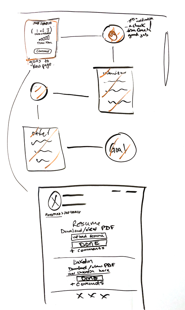
sketch wireframes
From our design studio session, we divvied up the pages and began to sketch out the wireframes.
The three major redesigns were the homepage, the roadmap and the tasks section.


4. Test
Medium fidelity wireframes
To test the functions of our new redesign, we created a medium fidelity prototype.
Even though we missed a few minor details, what we found was that
users were able to get through the tasks quickly enough,

first high fidelity wireframes
We continued testing functions, but we also wanted to test the aesthetic of our high fidelity prototype. We wanted to make the homepage more approachable but still keep the branding intact.
Here are some things we discovered:
users felt it looked young
they didn't understand the green
they loved the gamified roadmap
they were also able to see more value for the product, but weren't 100% sold just yet


Brand Redesign
We spoke to our stakeholder and updated her on our findings. She informed us that she wasn't attached to the current color palette or typefaces and we were free to change them.
So we did. We aimed for a palette that would feel friendly, professional and sophisticated.
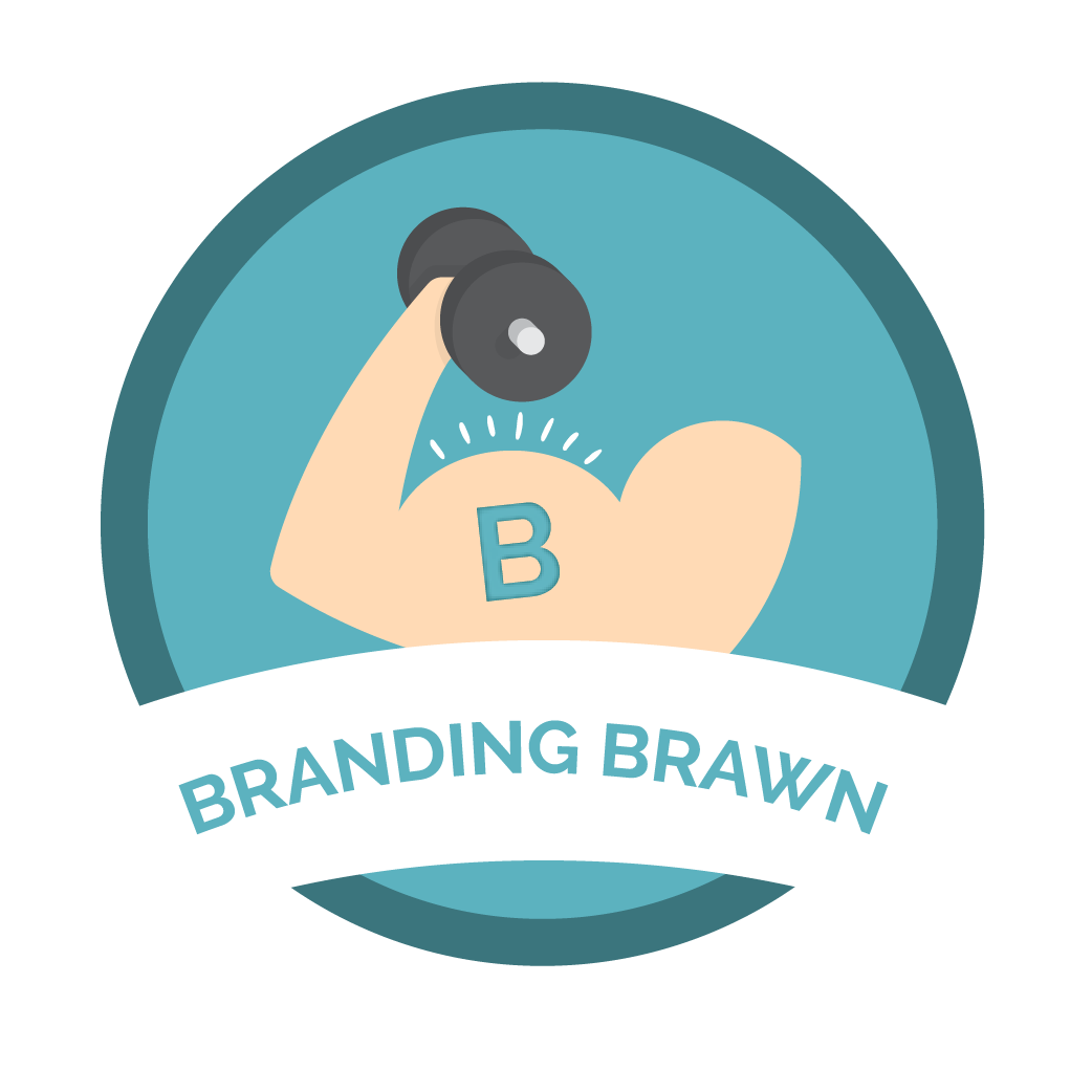
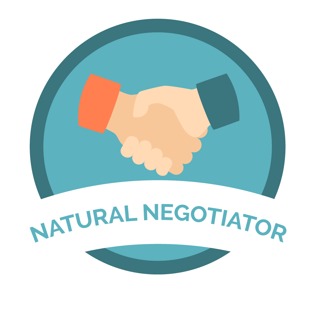
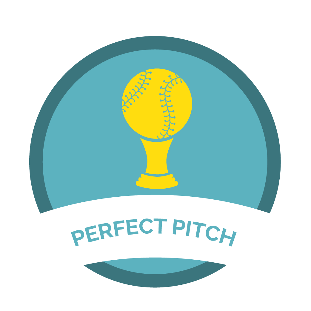
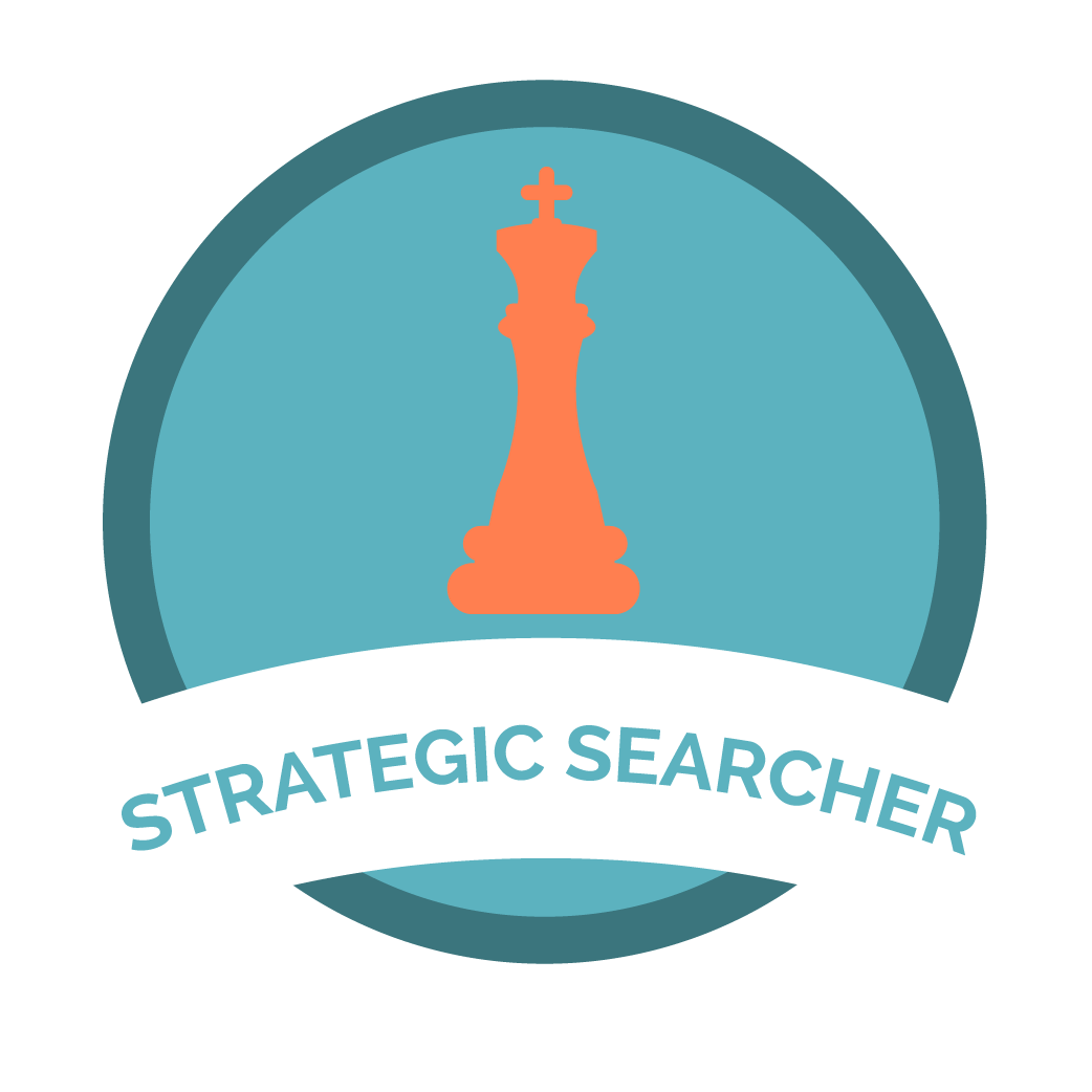
I also went ahead and created customized achievement badges for user milestone victories.

Click to enlarge.
second high fidelity wireframes
With this iteration, we aimed to keep it still friendly, approachable, sophisticated and most importantly, professional.
Here are some things we discovered during testing:
users felt the design was personable
they felt the new color palette looked more professional
they enjoyed the achievement badges
they were also able to see more value of a career coach
prototype
We used Adobe XD to prototype our website and product redesign.
5. Iterate
test and repeat
High fidelity prototype needs more testing to see if there's an increase in current users activity on the roadmap, and to test
the conversion of trial period into paid subscription.
next steps
Have an integrated file system
Have a native chat function
Integrate an AI chat box to answer commonly asked questions
A coach dashboard to keep track of mentees
Video testimonials of successful career mentees.
Careeer demo video
To create more trust and value in the brand, I created this demo video that Careeer can embed in their homepage to give users a better sense of how the product works.